I designed and delivered a comprehensive Figma design system for WTW’s insurance SaaS platform.
SEARCH AND PRESS ENTER
Willis Towers Watson
Scaling a complex enterprise SaaS platform through a unified design system
Project in brief
UI inconsistency across products slowed development and created a fragmented user experience.
Managing typography sprawl, complex component variants, and Light/Dark mode adaptability at scale.
A scalable, well-documented design system that improved consistency, speed, and cross-team collaboration.
Willis Towers Watson Ellen
Graham played a key role in bringing structure and consistency to a complex SaaS platform. He approached the design system with clarity and rigour, carefully balancing flexibility with maintainability.
His attention to detail, system thinking, and ability to collaborate across design and engineering made the system practical to use and easy to scale. The work laid a strong foundation for future product development.
My role
I was the UX/UI designer responsible for designing and delivering a comprehensive Figma-based design system for WTW’s insurance SaaS platform. My role covered system architecture, component design, variant strategy, and documentation, ensuring the system was scalable, usable, and developer-ready across desktop, tablet, and mobile.
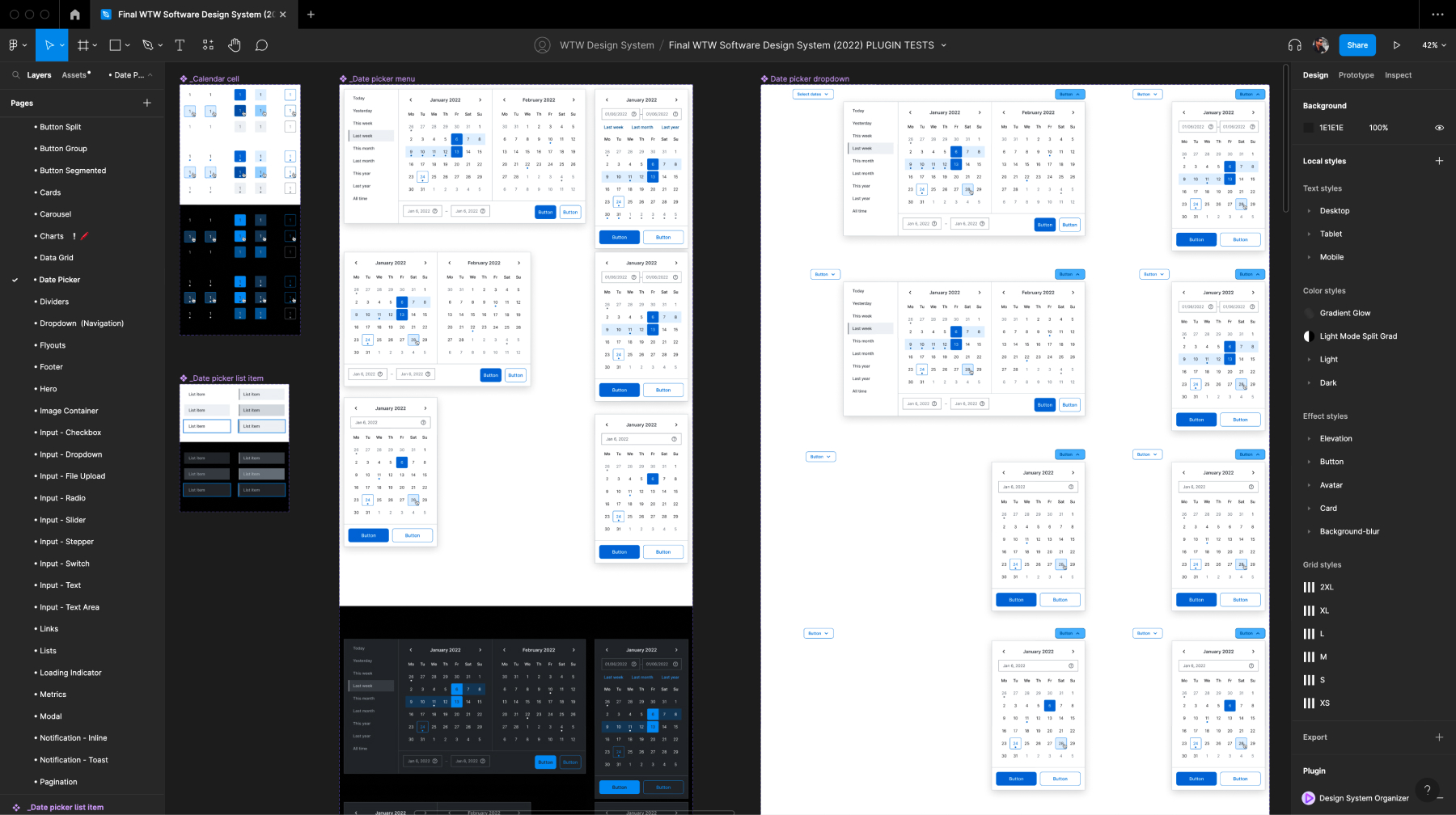
Comprehensive Figma component library for the WTW design system
Problem
WTW’s SaaS platform had grown organically over time, resulting in significant UI inconsistency across screens and products. This fragmentation created a disjointed user experience and slowed both design and development, making it difficult to scale new features efficiently.
Inconsistent cross-theme UI patterns before system standardisation
Challenges
The system needed to support a large, complex product surface area while remaining usable in day-to-day delivery:
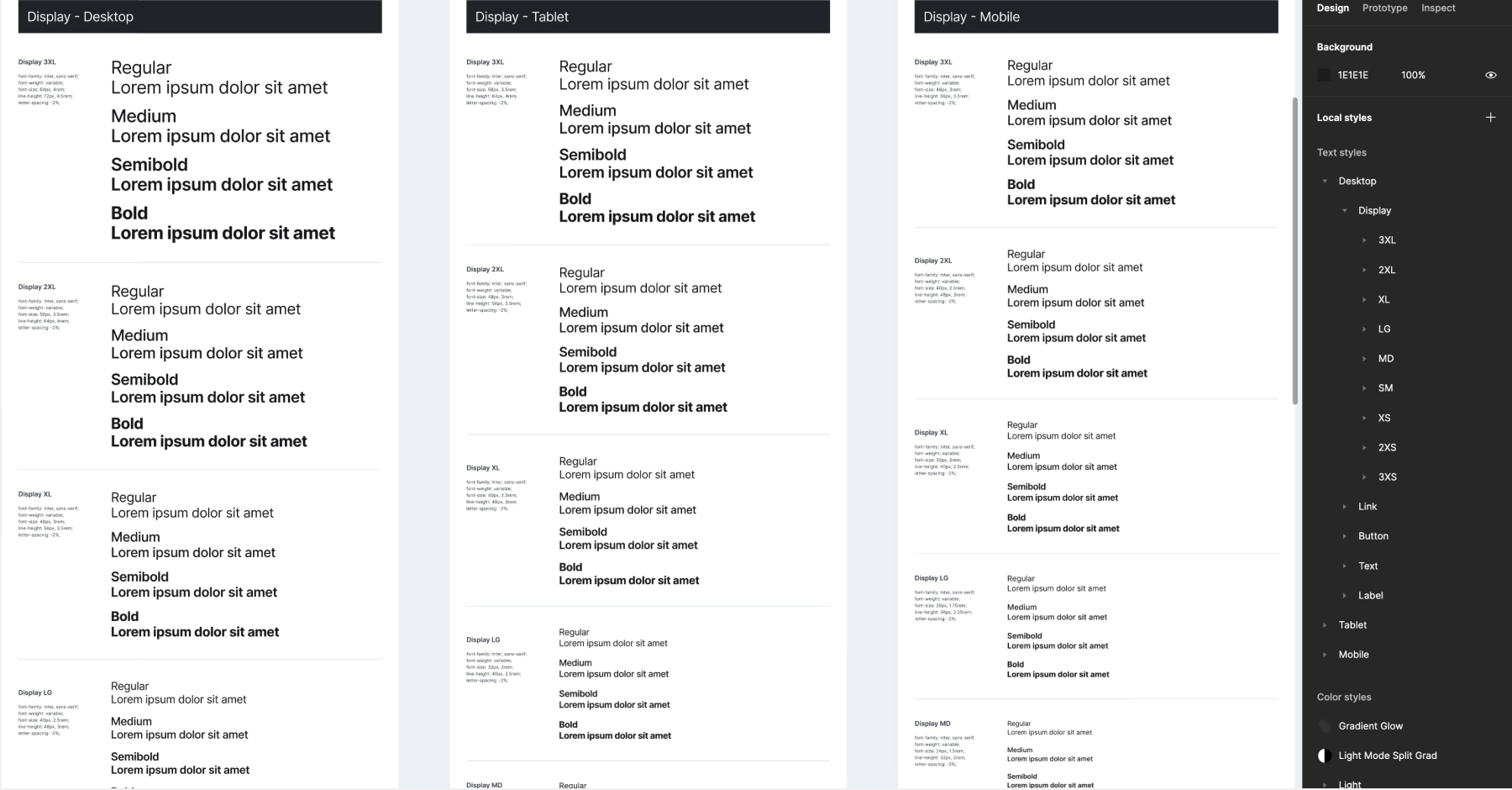
- Typography complexity
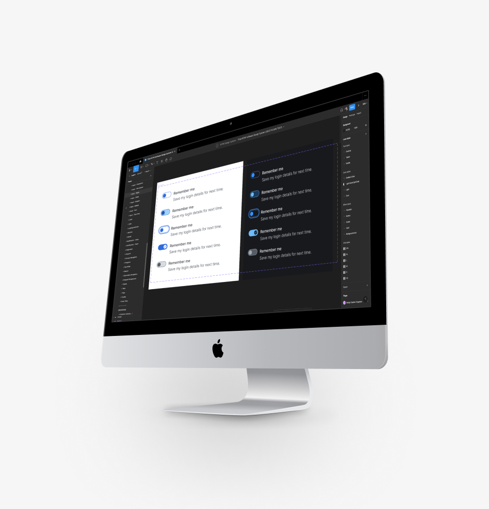
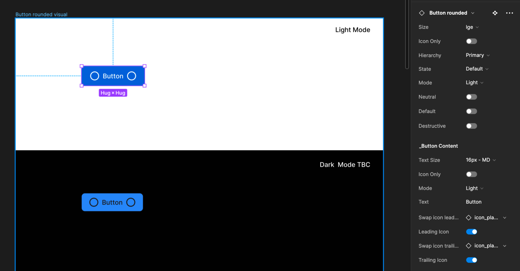
Over 80 type sizes existed across platforms, requiring consolidation into a consistent, reusable typographic scale. - Component explosion
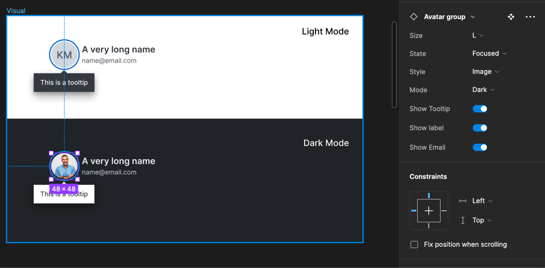
Core components such as buttons required more than 30 variants, with an additional 20 nested states. This demanded a streamlined approach using boolean and conditional variants to avoid unmanageable complexity. - Light and Dark mode adaptability
All components needed to function seamlessly across Light and Dark modes, while maintaining correct spacing, padding, and label hierarchy.
Managing high-variant components with token-driven controls
Outcome
The final design system established a clear, hierarchical foundation that improved consistency, speed, and collaboration across teams.
It enabled:
- Faster iteration and safer UI changes
- Reduced duplication across design and development
- A shared language between product, design, and engineering
The system became the foundation for ongoing product development, supporting scale without sacrificing quality or consistency
Typography system applied consistently across product UI